Monday, November 9, 2009

VILLAINS!


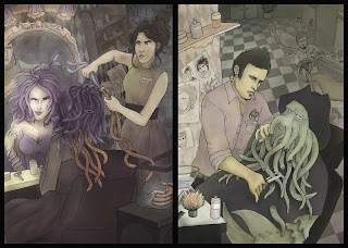
For this project, John had us pick two villains...one from 19th century literature (or before) and one from modern day film. We had to compare them in some way...or show how these two villains have something in common.

I chose Medusa and Davy Jones...and I outlined these in ink first, and colored them in photoshop. Approximate time was (much longer than I should have spent on these) about 21 hours of work from sketch time to completion...but I think it was well worth it! I really love how medusa turned out (and her snakes).

One thing that I think helped tie these compositions together was that pattern of the checkered floor. I think adding in that diamond pattern to the wall helped to tie their styles together. I originally intended to do a lot of flat color and shapes, but I ended up shading and rendering everything...which benefited me a ton. This is probably one of my best pieces I've created :D

Sunday, October 18, 2009

Career Guide Illustration


Here's something I whipped up in a day or so for the cover of StudLife's career guide that came out a couple weeks ago. I metaphorically tied the search for a job to a pirate hunting for treasure. I did this one with a micron and then scanned and photoshopped in the colors.

Tuesday, October 13, 2009

OMG new post finally! New illustration


It's been awhile and I've been bogged down with my 20 credits, but here is one of my latest illustrations for John's Editorial class. It's supposed to be an illustration for a book review about this pornographer who gets into a horrible car crash, gets badly burned and therefore loses his previous life of fortune and fame. Done with pastels and sumi ink on hotpress watercolor paper.

Wednesday, July 8, 2009

Really cool vintage-inspired Vector Illustrations!

http://abduzeedo.com/beautiful-modern-vintage-illustrations-tom-whalen

Such an amazing use of flat shapes and vectors to create very simple figures!

Tuesday, June 9, 2009

Because I have no time to post new artwork:

http://www.webdesignerdepot.com/2009/05/50-beautiful-and-effective-package-designs/

I thought this was pretty neat to look at knowing I'm working in the marketing field right now

Thursday, April 2, 2009

Get pwned with manual shutdown in Power Plants!


A couple of the colored editorial illustrations for an article (an old, old 2005 article) expressing that manual shutdown for powerplants was inferior to an automatic shutdown, and that manual shutdowns are very complicated.

Tuesday, March 24, 2009

So this is a way to add more UMPH to a website?

http://www.webdesignerdepot.com/2009/03/50-inspirational-website-introductions/

Of course one of my favorite websites to visit for more tips and trick in the art (and website making) world...Webdesignerdepot.com

This post shows a bunch of examples on how websites use an opening face page consisting of a sentence or two explaining the purpose or short bio of the artist. Apparently it's a new trend these days...and I have just the spot to do it on my website!

http://www.snowwhitedesign.com

I have always tried to figure out what to do with that spot...maybe I'll handwrite a short intro there. Right now the text seems a little artificial and too digital to really match up with the style of the drawing. I'm also considering maybe adding in some color to the drawing instead of keeping it purely blue and white.

Any thoughts?